
Super Strength Made Flexible:
Renaflex Logo Story

A new chapter needed its own identity.
As Renacon entered the fibre cement board category, the new offering needed a name and identity that could carry the parent brand’s credibility while establishing a distinct proposition.The task was to bring together two qualities central to the product: the strength construction demands and the flexibility design needs.

Rooted in Renacon. Open to possibilities
The name brought both sides together.“Rena” retained the connection to the Renacon legacy.“Flex” introduced versatility and the freedom to work across different applications.Renaflex gave the new brand a clear relationship with its parent and a simple idea to build its identity around.
How do you make flexibility look dependable?
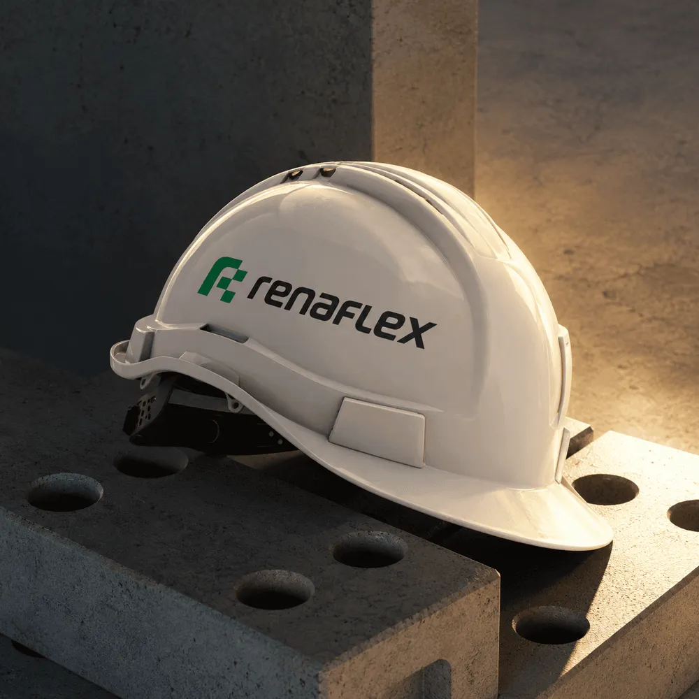
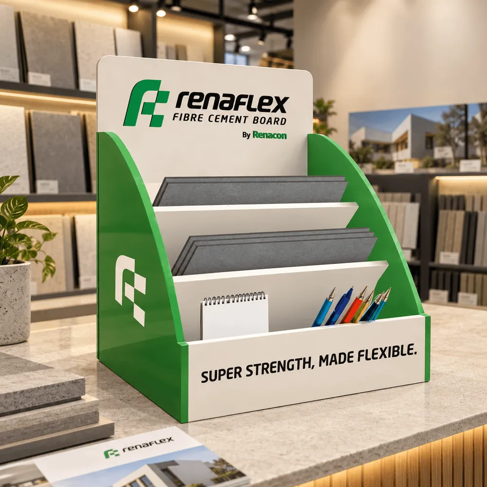
The logo answered this through the relationship between fluid and structured forms. A flowing lowercase “r” introduced movement and adaptability. Geometric, board-like blocks brought order and solidity. Together, they expressed flexibility within a construction system, connecting the material to the possibilities it enables.
The symbol made the central thought visible: freedom of application, supported by structure.
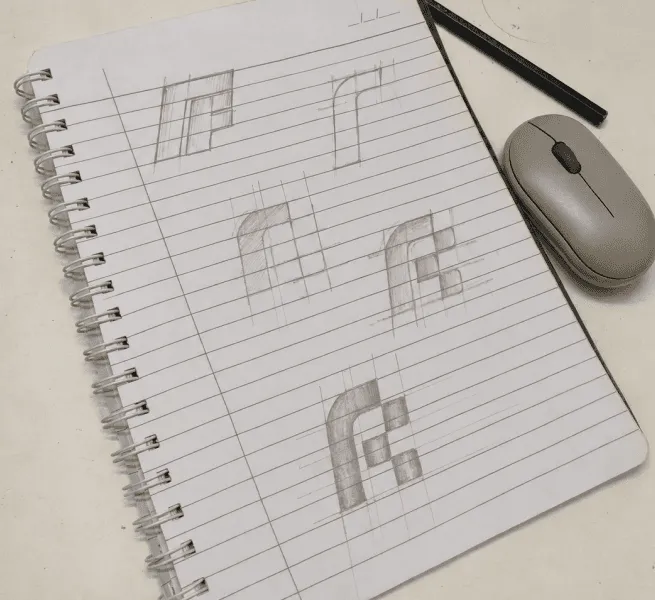
Every element followed the same thought.
Clean typography complemented the symbol’s geometry. Green, white and dark neutrals formed a restrained palette, giving the identity a clear, consistent presence.
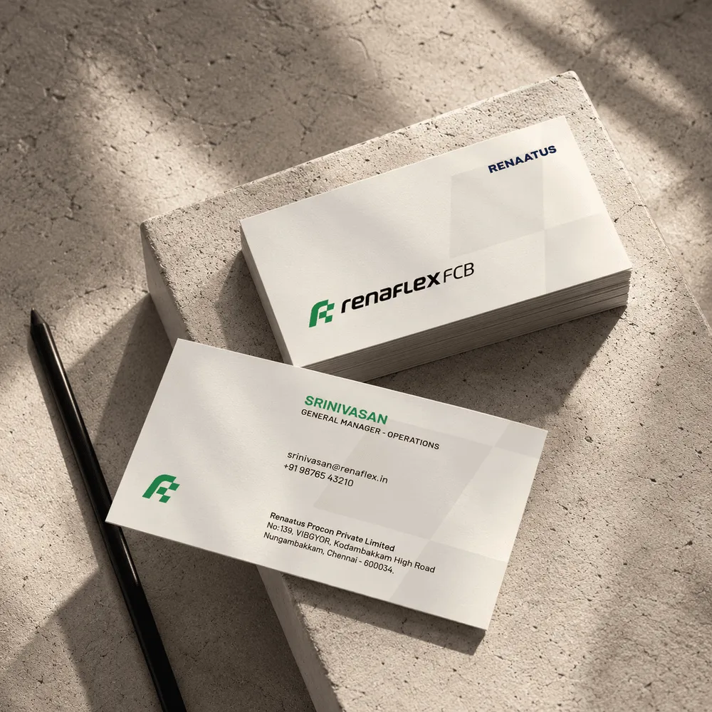
The Renacon endorsement retained the parent connection while allowing Renaflex to lead with its own name and symbol. This balance gave the brand room to establish itself independently within the larger portfolio.
Renaflex Green
#00A74C
Pure White
#FFFFFF
Graphite Black
#221E1E
Soft Gold
#FFF9AE
Deep Green
#005B31
A clear foundation for what came next.
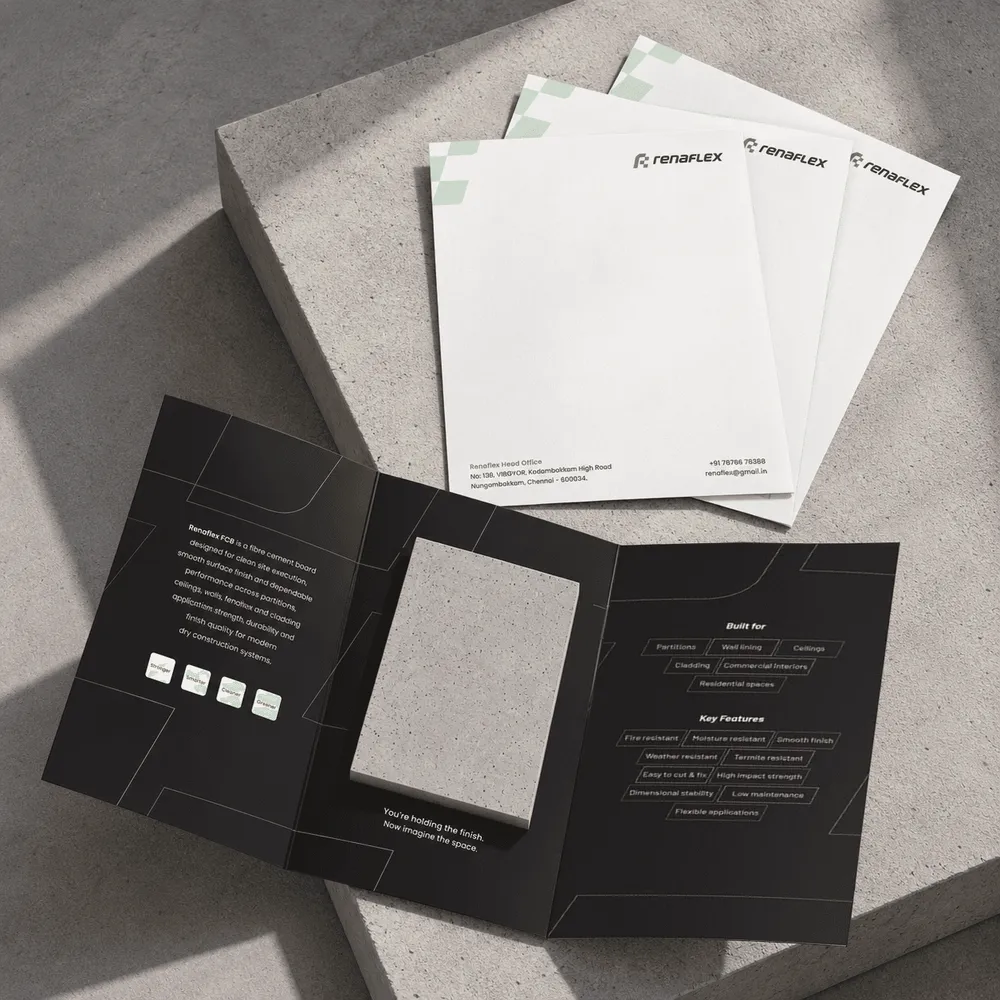
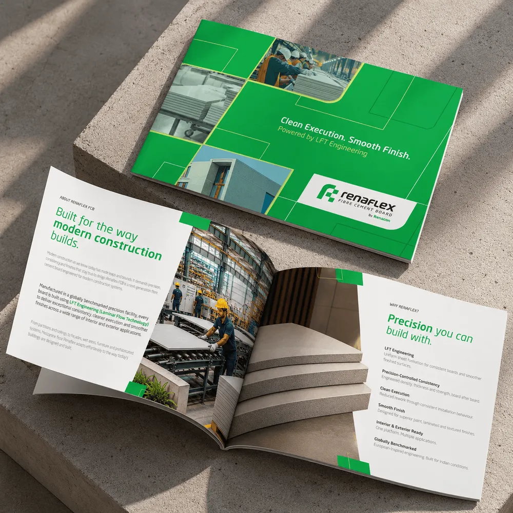
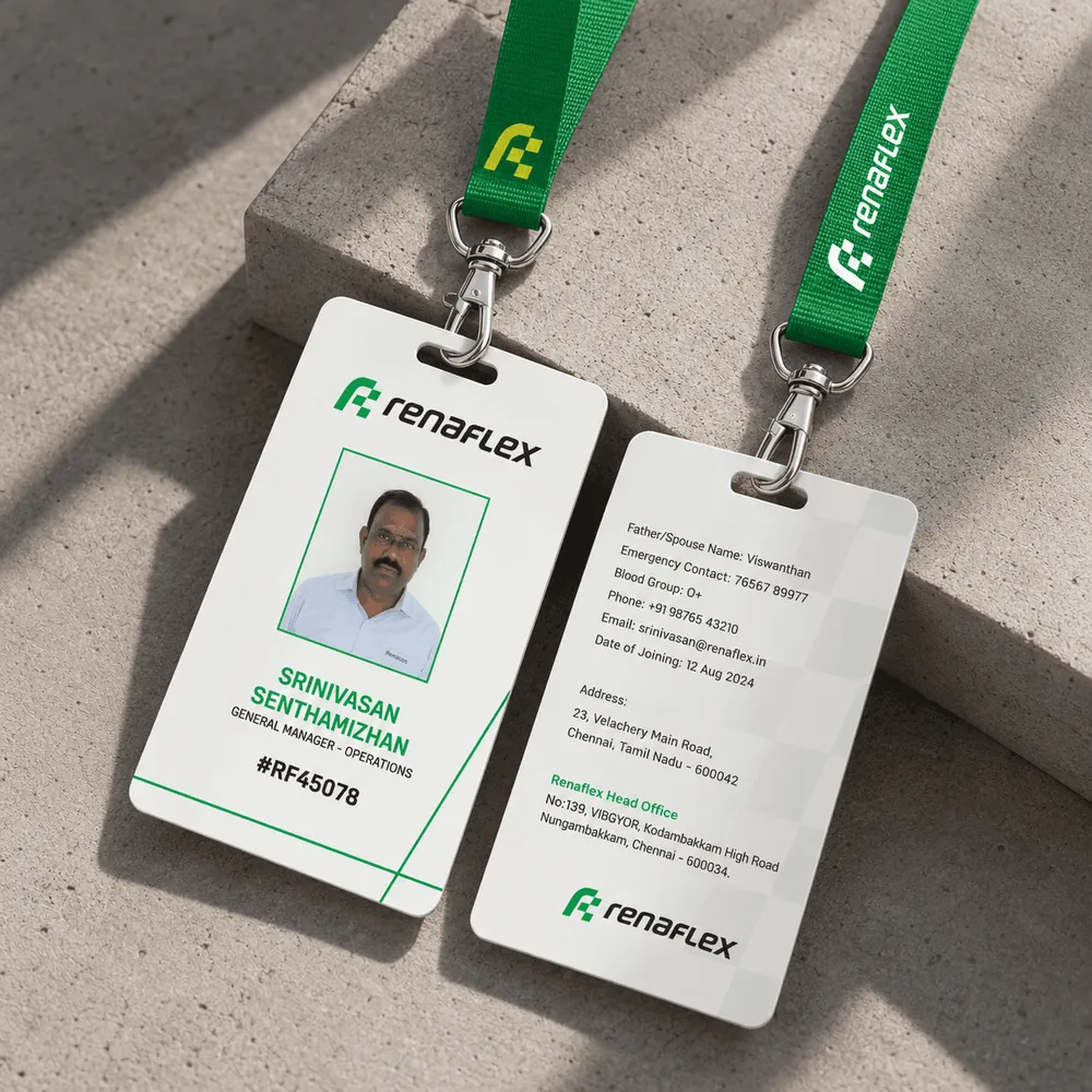
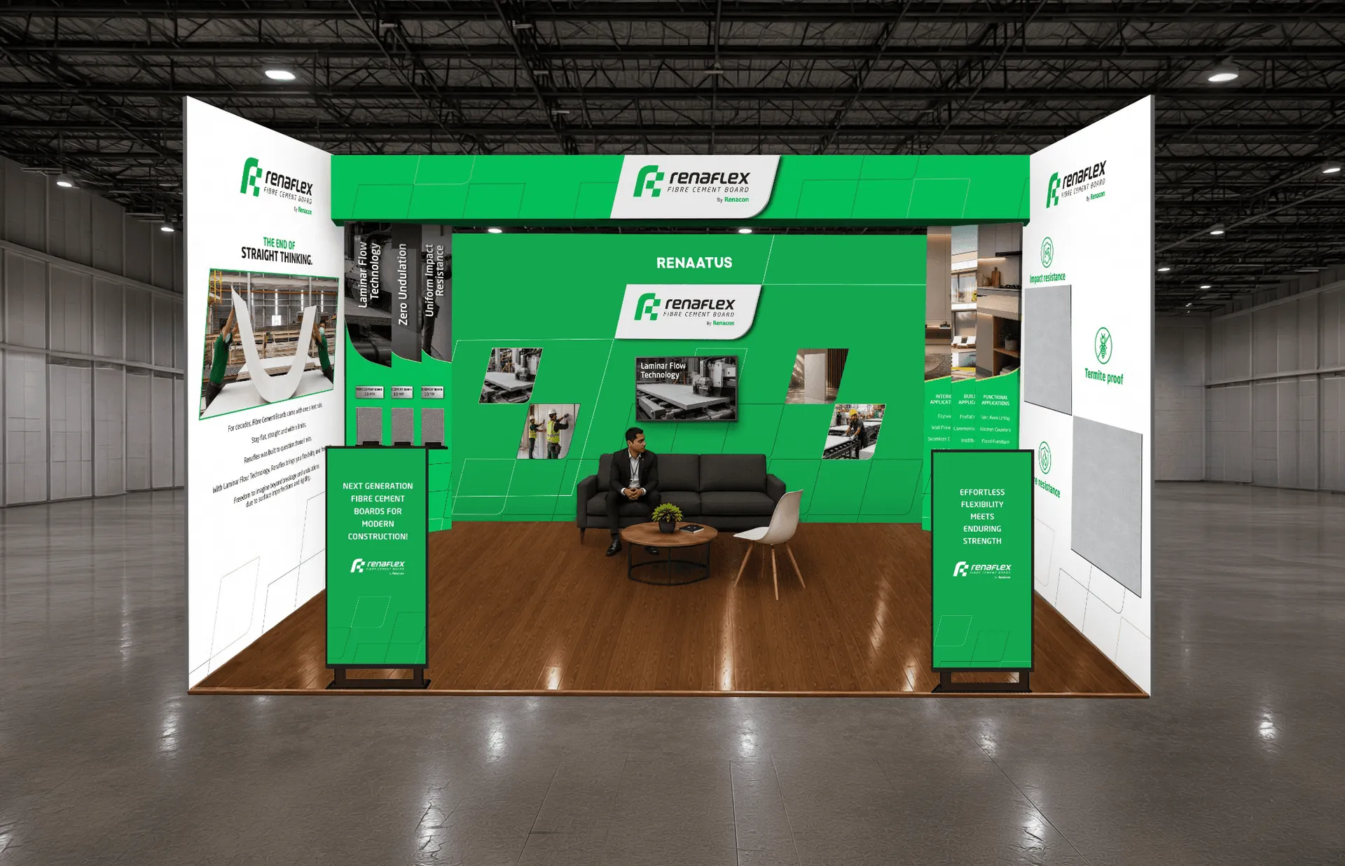
The name and logo established a coherent starting point for Renaflex’s communication. The same balance of precision and adaptability could carry into product literature, dealer communication and launch materials.
Renaflex now had an identity built around what it stood for: dependable construction with greater possibilities for design.